For my next assignment I was working on my level one project. I decided to pick the direction of advertising and I worked to this theme / idea of 3 wishes. To help start off the idea generation process I started collecting secondary reference of how dreams and wishes can be interpreted. I looked at how others had interpreted this idea, and the direction they took.
Monthly Archives: April 2014
Seagull Final Outcome
Now that I had explored manipulating my photograph of a seagull, I started overworking the bird with various patterns and textures, to create this feeling of royalty. By trying to create this big impressionable bird I am changing its context from the original form. By working on a black background I am isolating my bird, and drawing all the attention to the birds its self. I added in extra typography at the top to compliment the central imagery. I also added in my own illustration of the Juicy Couture logo I created, this added a personal twist to my work, and developed my photography/layer manipulation outcome.
Another Final Outcome Development
Now that I had explored a variety of floral outcomes and compositions I decided to change my direction. I started to manipulate a seagull, I decided to pick this bird as seagulls are not seen as desirable creatures and are a very common bird in the UK. So by manipulating one of my photographs and changing the colours and tones I am changing the context, and creating this desirable feeling due to my application of colour. I decided to work with darker tones this time in comparison to my really bright and bold final outcomes, as I wanted to create a new look to my new direction for my final outcome.
Final Outcome Fashion Assignment
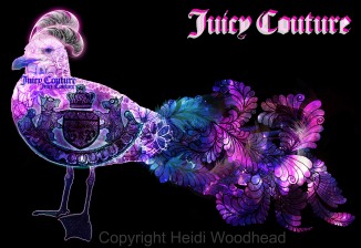
To develop my explorations for my fashion assignment, I created another final outcome, where my main focus was on the perfume bottle. By placing my perfume bottle at the centre of the composition allowed me to create this very strong viewing point. I also created a floral background to compliment the perfume, as this perfume has top notes of flora. By keeping this outcome very bold and bright, I am looking at this refreshing theme, and communicating this feeling of summer again. Looking at this outcome, it has a very complex structure and at times could look too much, however if my outcome were to be used in the advertising industry it would be very eye catching due to the arrangement of colour. I think that this outcome would be best situated on the front of a shop window or on a large billboard. I added in typography in the top corner to compliment the imagery and to also define the brand. To create this outcome, I used all my own primary photographs and focused a lot on layer manipulation and slightly colour alteration.
Final Outcome Fashion Assignment – Logo
For my final outcome, I wanted my chosen brand to be the main talking point which meant that the logo had to be the main feature. For the logo its self I created an illustration influenced from Juicy Couture. I kept my illustration very patterned and decorative to add my own personal twist. I also added in a complex background to really bring forward the typography also added in my bow illustrations again to really encourage this idea of fashion. In my final outcome I used all my own primary reference which made my outcome more personal and in my own style.
Perfume Bottle Exploration 3
I continued working with this theme of perfume bottles and juicy couture, but to show development I added in some hand rendered illustrations. I scanned in my illustrations onto Photoshop, and then using layer manipulation I overworked the drawings with photographs, to create this floral effect to compliment my fashion based theme of work. I continued working with bold and bright colours, as I wanted to communicate this feeling of summer and freshness, by keeping my advertisement bright and bold it would make it very appealing to the fashion industry. By adding in my hand rendered illustrations of bows, it just adds that personal element and you can see my own style coming through into my work.
Perfume Bottles Exploration 2
To continue working with this theme of perfume bottles and fashion I created another exploration featuring photography, for my fashion assignment. In this exploration I looked at creating this reflected effect, which was achieved by flipping my imagery and lowering the opacity. Again, I was working to a very structured and basic composition. In this exploration I found that my selected brand wasn’t fully defined due to the effect of the perfume bottles. However, the idea of reflection worked well within this piece.
Perfume Bottle Exploration – Fashion Assignment
For my fashion assignment decided to work with the brand of Juicy Couture, and I decided to explore this idea of perfume in terms of fashion, I kept my composition very basic and structured to create this repeat pattern format, and by manipulating my photographs of the perfume bottles I was able to achieve these florescent colours. By working with such extreme colours, I am communicating this feeling of happiness and summer and by keeping my advertisement bright and bold it would make it very appealing to the public and eye catching tried to keep the message plain and simple.
Fashion Assignment – Illustration&Photoshop
To develop my fashion assignment, I started creating hand rendered illustrations, which could be taken forward into a final piece scanned in my illustrations onto Photoshop, and then using layer manipulation I overworked the drawings with photographs, to create this floral effect to compliment my fashion based theme of work.